

Purchase Funnel Experience Redesign
LegalZoom
00. At a Glance
CLIENT
TIMEFRAME
MY TASKS
PLATFORMS
DESIGN TOOLS
KPI
COLLABORATORS
LegalZoom
June 2019 - October 2019
Conducted web audit, heuristic evaluation, usability testing of current production, user research based on unmoderated user interviews, persona, information architecture, mid-fidelity wireframes and prototype
Mobile
Sketch, InVision, UXPin, Zeplin, Validately
Conversion rate, retention rate
UI Designer, Product Manager, Product Marketing, Copywriter, Developers, Data Analytics, Legal counsel, Project Manager, Business Analytics, SEO, SEM, QA
Project
Corporation Formation service brings in millions of dollars each year for LegalZoom. From a business perspective, we aim to increase conversion rates on our mobile experience because mobile contributes to 50% of our overall traffic. We hope to continue to grow our business products through designing a device adaptive experience. We optimize users’ experience based on the devices that they are using.
From a customer’s perspective, understanding and choosing the correct entity to form for their small business is challenging because of the amount of research they need to do. Especially for first time business owners, it’s scary to figure everything on their own. Throughout this case study, we figured out how might we help SMB owners to form their entities easily, lower the amount of self-educating, and help them entrust their dreams to LegalZoom.
My role as a UX Designer was to design an adaptive experience through conducting user research, usability testing, and synthesizing the results, translating results into deliverables and final experience. Throughout the process, I collaborated with product manager, UI designer, copywriters, product marketing manager, analytics, project manager, SEO, developers, QA.
Challenge
My challenge is to understand how Inc users interact with our current experience, and design an experience for them that is transparent and mobile friendly while collaborating with other cross-functional team members.
A constraint for this project is that I cannot completely change the entire experience. I still need to follow the original purchase funnel from the desktop experience since this project focuses on mobile adaptive experience.
Solution
With user research and usability testing insights, we designed an experience that is mobile adaptive that provides transparent pricing and add in bite-size tips and resources throughout the flow that helps users understand formation process. Utilizing design principles to create a simple visual hierarchy for the final design, allowing users to quickly absorb the information and purchase through our mobile experience. We hope our new design would provide a feeling of ease as they go on this intimidating journey of forming their business.
01. Discovery & Research
Heuristic Evaluation
I conducted heuristic evaluation, because we want to have a benchmark and understanding of how our current experience is.
Through this exercise, I discovered numerous amount of inconsistency in our current experience.
Usability Testing
I also conducted a usability test with our current experience on both desktop and mobile. This exercise lets me learn how users are interacting with our current experience, and how we can improve in our next iteration.
Here are some problems we discovered through heuristic evaluation and usability testing:

Competitive Analysis
I conducted a competitive analysis where I researched 3 competitors that only form corporations because we believe they are most knowledgeable in that field. This exercise helps us understand how is the current market and how is LegalZoom ranked among our competitors.
Insights that shaped our final design solutions:
Limited subscription models
Most competitors offer up to 3 subscriptions models to avoid users feeling choice overload, and divide models based on users’ journey (pre-formation, post-formation), not filing speed.
Clear pricing and product details
Instead of having users go through a flow to add products into their carts, all 3 competitors include pricing in their global navigation - always allowing users to clearly read about pricing and product details
User Interview
I conducted user interviews with 6 small business owners in order to empathize and gain deeper understanding of my users.
A pattern that I found:
Main reason to start Inc
Separate entity for legal and liability protection, better tax protection.
Types of research before forming
Users mainly talked to professionals (accountants and attorneys), did online research, and talked to friends and families who have formed before.
Frustrations during the process
The amount of reading and self-educating users did in order to make sure everything is done correctly.
Struggles after forming
Building a good team (accountant, professional resources), having more questions and finding guidance, ways to get funding.
02. Define & Ideate
User Journey
In a small business owner user journey, we are solving their problems during the “Making it official” stage. Looking at the user journey, help me understand how our experience take part in their bigger journey.
The problem during this stage is information overload. Small business owners often do a lot of googling, asking friends and families that have started their own business for help. However, each business’s situation is unique and users often still feel like they are missing something after hours of research. We hope to resolve this frustration with our new design.

Persona
I drafted a persona based on my user interview and empathy map’s insights in order to stay focus on who are my users.

“So how might we help SMB owners to form their entities easily, lower the amount of self-educating, and help them entrust their dreams to LegalZoom?”
03. Interaction Design
Mid-Fidelity Wireframes
Going through the formation flow, there were 2 main type of pages: subscription and package. I explored different variations and tested my design with usability testing.
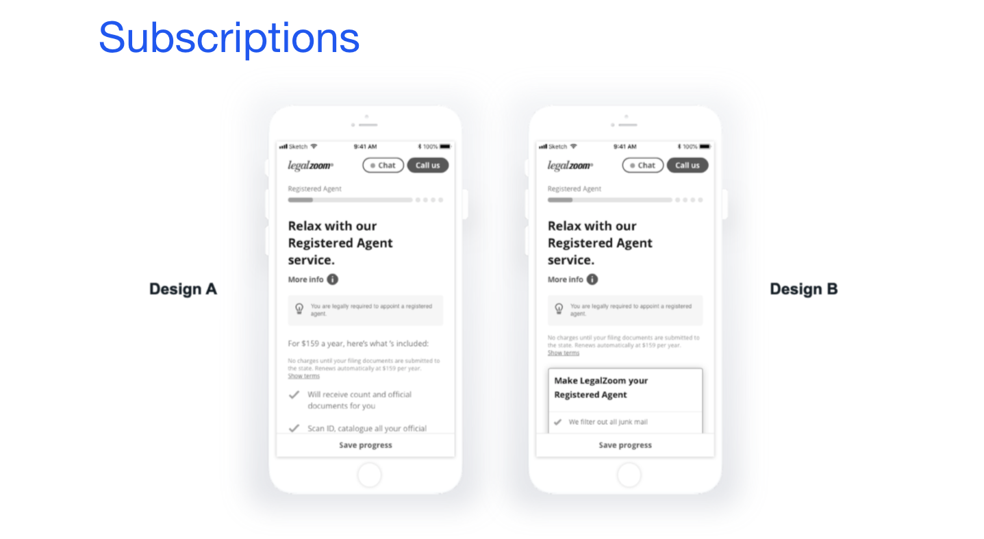
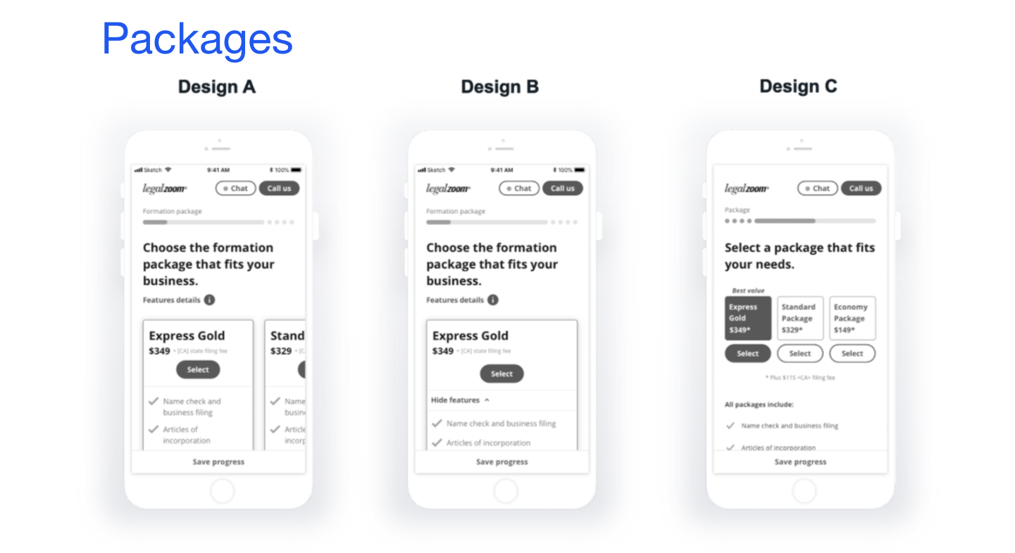
Usability Testing
I conducted usability testing in order to see how users would interact with the new design. We launched an A/B test. We asked users to complete a few tasks on each design and observe their behaviors.
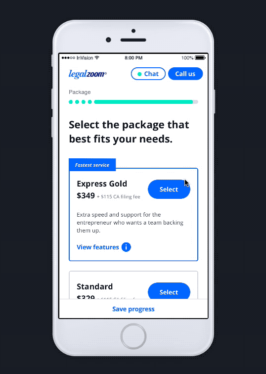
Final UI Solutions

01.
Self-educating along the way
To lower the amount of self-educating, we condensed relevant educational information into “More info” and placed it next to related question, so users can learn more about business formation as they go through the flow.
We also provided short tips that’s easier for users to digest. If they have any question, they know they can easily chat or call us.

02.
Concise and transparent information
We want to simplify product information, so it’s clear for users to understand what they are purchasing, why they need this, and how much this cost because one of the biggest user needs is transparency and pricing from our user interviews and usability testing.
03.
Mobile friendly design
The entire flow’s interface is now mobile friendly. For the package selection specifically, we added a simple line of description to each package, so it’s easier to digest and understand how each package is different.
Hand off to UI and Developers
After I finished testing, I handed off my wireframes and prototype to our UI designers and developers. I continued to be involved and collaborated with our UI designers and developers.
Achievements
The new design now aids the digital experience of LegalZoom’s corporation ($17M) mobile funnel, which is 50% of the product traffic. Conversion rate was increased by 18%.
This experience has been implemented to our LLC formation mobile experience because of its success. Our LLC formation product contributes to about 60% of our company revenue.
Learnings Recap
This project was rewarding in many ways. I was fortunate to have given the time to conduct heuristic evaluation, usability testing, competitive analysis. At first our product manager was pushing us to rush into wireframing the new experience, but my UX Director and I stood our ground and requested time to dive into research to further understand the users and their current experience before defining a solution. Not every project has this luxury of time, but I’m glad that we were able to truly empathize our users.


